
Proofing winter in September
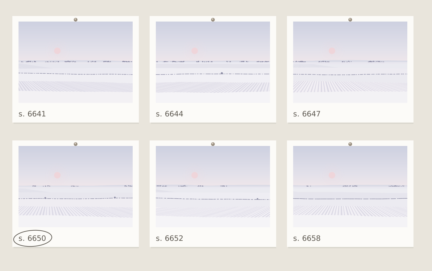
There is something slightly absurd about proofing snow in September. The workshop window is full of late-summer light, the linden trees across the yard are still green, and on the wall are a dozen small prints of frozen fields. But the two new Winter Fields pieces, First Snow on the Furrows and Frost Line, have taken most of this month, and they will join the series in October.
Winter Fields is the hardest series we print, for a simple reason: there is almost nothing there. In Frost Line the sky, the snow and the far trees all sit within a narrow band of very pale greys and violets. On screen that is easy. On paper, the printer builds those colours from tiny amounts of light grey, light cyan and light magenta, and when there is so little ink, any imbalance shows.
Our first full-size proof of Frost Line looked right under the viewing lamp and faintly green by the window. The second went the other way and turned pink in daylight. That shift between light sources is called metamerism, and pale neutrals are where it bites hardest.
The fix wasn't in the printer settings. I changed the palette in the program itself, moving the sky a few steps toward warm and taking a little cyan out of the snow, then generated the image again from the same seed and proofed again. Frost Line took nine proofs. First Snow on the Furrows took five, because the brown earth in the furrows gives the eye something solid to hold on to.
A change of paper
The other decision this month was the paper. Winter Fields had been printed on a bright white cotton sheet, and it looked lovely, crisp and cold. But some of that whiteness came from optical brighteners, which absorb ultraviolet light and give it back as blue. They fade. Over the years the sheet slowly drifts back toward its natural, warmer tone, and in an image that is mostly paper, that drift means the image itself changes.
From this release on, Winter Fields is printed on the same natural white sheet as Ridgelines. Next to the old paper it looks a shade softer, and it will look the same in ten years. Prints from the earlier Winter Fields editions will also be made on the new paper from now on.
Choosing the seed
For once, choosing the seed was the quick part. For Frost Line I rendered around two hundred candidates, printed thirty small ones, and pinned six on the wall for a week. Seed 6650 was the one I kept walking back to: the tree line is thin and broken in the right places, and the furrows in the nearest field run off to one side, away from the sun, which stops the picture from feeling symmetrical.
One lesson from Field with Pale Moon last year was applied again here. A disc that is almost pure paper white reads as a hole punched in the sky. The low sun in Frost Line is mixed nearly all the way to the sky colour, with just enough rose in it to find. Small things, all of them. That is most of what proofing is.
Mara